
Design and usability
If you are unfamiliar with principles of design, especially website design, take a few moments to familiarize yourself with some important concepts. These design concepts work together to create barrier-free environments that make information accessible to more people in more situations.
Accessible, inclusive, usable, universal
When it comes to web design, these four words – accessible, inclusive, usable, universal – are used often and sometimes interchangeably. Most of the ideas and information noted in this Resources section speak to at least one, if not all, of all these concepts.
The W3C, the international community that develops web standards, has a number of great resources on these topics, such as W3C Web Accessibility Initiative: Accessibility, Usability, and Inclusion.
- Universal design refers to the designing of products and environments to be aesthetic and usable, to the greatest extent possible, by everyone regardless of abilities/disabilities, age, experience or status. Disabilities can be permanent, temporary, and situational.
- Usability refers to how easy your website is to use. Usability should play a role in every step of a design process. There are many articles online about website usability and how to improve it. Ultimately, the best indicator of a website's usability is to test it with real users. Watching someone navigate through your site can quickly illuminate problems. Test early, test often, and test with as many users as possible.
- Inclusion in web design is a process that emphasizes universal design, an understanding of diversity, and the involvement of community in shaping project outcomes.
- Accessibility addresses deficits in web design that create barriers to users with differing abilities. More on accessibility...
Mobile first, responsive
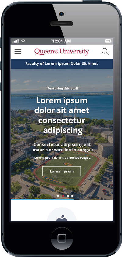
All Queen’s websites should be built and maintained with responsive design in mind. This means designing for the best and most consistent experience possible across operating systems, browsers, and screen sizes.
While you may be creating and editing on our desktop computer, it is important to remember that many of the website's users (indeed, more and more all the time) will be accessing your information on a mobile device, such as a tablet or a smart phone.
The term "mobile-first" simply means that design starts by considering mobile devices first, as they have the most limitations when it comes to rendering content, such as smaller screen sizes and less bandwidth.
Responsive design considers display "breakpoints" for page content, where the design adjusts (or responds) according to the screen size used. It is important to test how your page displays on a phones and tablets. Check out how content stacks on smaller screens and ensure that the reading order of you page content is intact. There are browser tools that enable web developers to perform sophisticated testing, but to start, web editors can do some basic testing on various phones and tablets.
Structure
Main Navigation
Readers should be able to intuit your site content from your tab headings and page titles. Consider the order of tabs across the top and then down through the pages below – is the most important content higher in the hierarchy? Is the language in your menu clear, concise? Will users intuit where to click?
Pages listed in your main navigation should link to pages within the site, not out to pages on other sites. Links to other websites can be hosted and highlighted in page content instead. Learn more about creating menus...
Planning ahead: Before you start building your site in WebPublish tool, ensure that you have a plan for your site structure, on paper or in a spreadsheet, and get input from as many stakeholders as possible. There are many ways to do this. Consider this example of a structural plan for a website.
Download a PDF version and see the details (PDF 70KB)
![[example of mock up of site structure]](/webpublish/sites/wpswww/files/Images/Resources/Site_Map_Example.jpg)
Orphaned pages
“Orphan pages” are those that are not linked to at all from your site's pages or navigation. Avoid this, and be aware that these pages can still be found through a search.
Menu links versus page links
A good rule of thumb to keep in mind is that if a page is important enough to create, there should be a way for people to find it through your main navigation structure. Exceptions to this requirement can include news articles or event listings for which there is an index page or "aggregator" area.
For some sites with a large number of content pages, though, having a link to every page of the site available through the menu can start to feel cumbersome for the user. In case where you do not want to make pages available in the main menu, ensure that these pages are still nested under parent pages in your site structure (see Structure > Menus > Main Navigation in your admin menu) and uncheck the "enabled" box. Also, in for these pages, also ensure that the URLs for each page are similarly nested. (For more, see "URLs and File Naming" info)
Hierarchies: flat versus deep
Consider a flat approach to hierarchy (limited to about 3 levels deep) before a deep deep one. There are pros and cons to each, and both still require attention to category labelling, but a deep hierarchy requires more understanding of broad-category labelling from your user at the outset. A flat hierarchy allows you to get more specific in your labelling of menu items sooner.
Footer
Use the footer to display basic contact information. Add a link to other partner sites, such as your department website, faculty website, research centre or institute. Other content that users expect to find in a footer include social media links and contact information.
Queen's Visual Identity for websites declares that the footer of Queen's websites must include Queen's University logo.
It is also recommended that Queen's sites link to the traditional territories statement: Queen’s University is situated on traditional Anishinaabe and Haudenosaunee Territory. Please note that the statement now links to a page on the Indigenous Initiatives website. Use the following URL:
https://www.queensu.ca/indigenous/land-acknowledgement#profile-tab
Learn more about footer menus in WebPubish...
Additional Resources
See LinkedIn Learning (log in with your Queen's NetID) for courses on usability, such as:
User Experience for Web Design
Host: Chris Nodder
1h 49m – Beginner
UX Foundations: Content Strategy
Host: Morten Rand-Hendriksen
1h 24m Beginner + Intermediate