Colour is an essential component of the Queen’s University brand. Refer to the colour guidelines for the correct colour formulas and guidance on how to properly apply colour in branded applications.
Primary Colours
Queen’s University is widely recognized for its unique Tricolour palette of blue, gold, and red. These three colours are the essence of the Queen’s brand and are designated as the primary colours.
Tricolour must be incorporated into all applications in a mindful way that allows the message and imagery to be the focus.
PMS – 295
CMYK – 100, 63, 0, 67
RGB – 0, 36, 82
HEX – #002452
PMS – 124
CMYK – 0, 29, 100, 1
RGB – 250, 189, 15
HEX – #fabd0f
PMS – 187
CMYK – 0, 100, 74, 26
RGB – 185, 14, 49
HEX – #b90e31
Secondary Colours
A secondary palette of neutral colours may be used with the primary palette to provide balance.
CMYK – 0, 0, 0, 0
RGB – 255, 255, 255
HEX – #ffffff
CMYK – 0, 0, 0, 5
RGB – 241, 242, 242
HEX – #f1f2f2
CMYK – 0, 0, 0, 10
RGB – 230, 231, 232
HEX – #e6e7e8
CMYK – 0, 0, 0, 20
RGB – 209, 211, 212
HEX – #d1d3d4
CMYK – 0, 0, 0, 40
RGB – 167, 169, 172
HEX – #a7a9ac
CMYK – 0, 0, 0, 60
RGB – 128, 130, 133
HEX – #808285
CMYK – 0, 0, 0, 80
RGB – 88, 89, 91
HEX – #58595b
CMYK – 0, 0, 0, 100
RGB – 33, 33, 33
HEX – #212121
PMS – 401
CMYK – 28, 25, 28, 3
RGB – 180, 174, 168
HEX – #b4aea8
PMS – 403
CMYK – 39, 36, 40, 14
RGB – 144, 137, 130
HEX – #908982
PMS – 405
CMYK – 49, 47, 51, 32
RGB – 106, 98, 92
HEX – #6a625c
PMS and CMYK: Print
PMS colours are determined by the PANTONE® Matching System, a tool used to consistently reproduce colours. They are utilized for jobs printed with specially matched inks. CMYK values are utilized in 4-colour process printing using cyan, magenta, yellow, and black.
RGB and HEX: On-screen
RGB values and HEX codes are used for digital or online applications including presentations, websites, social media, and digital ads.
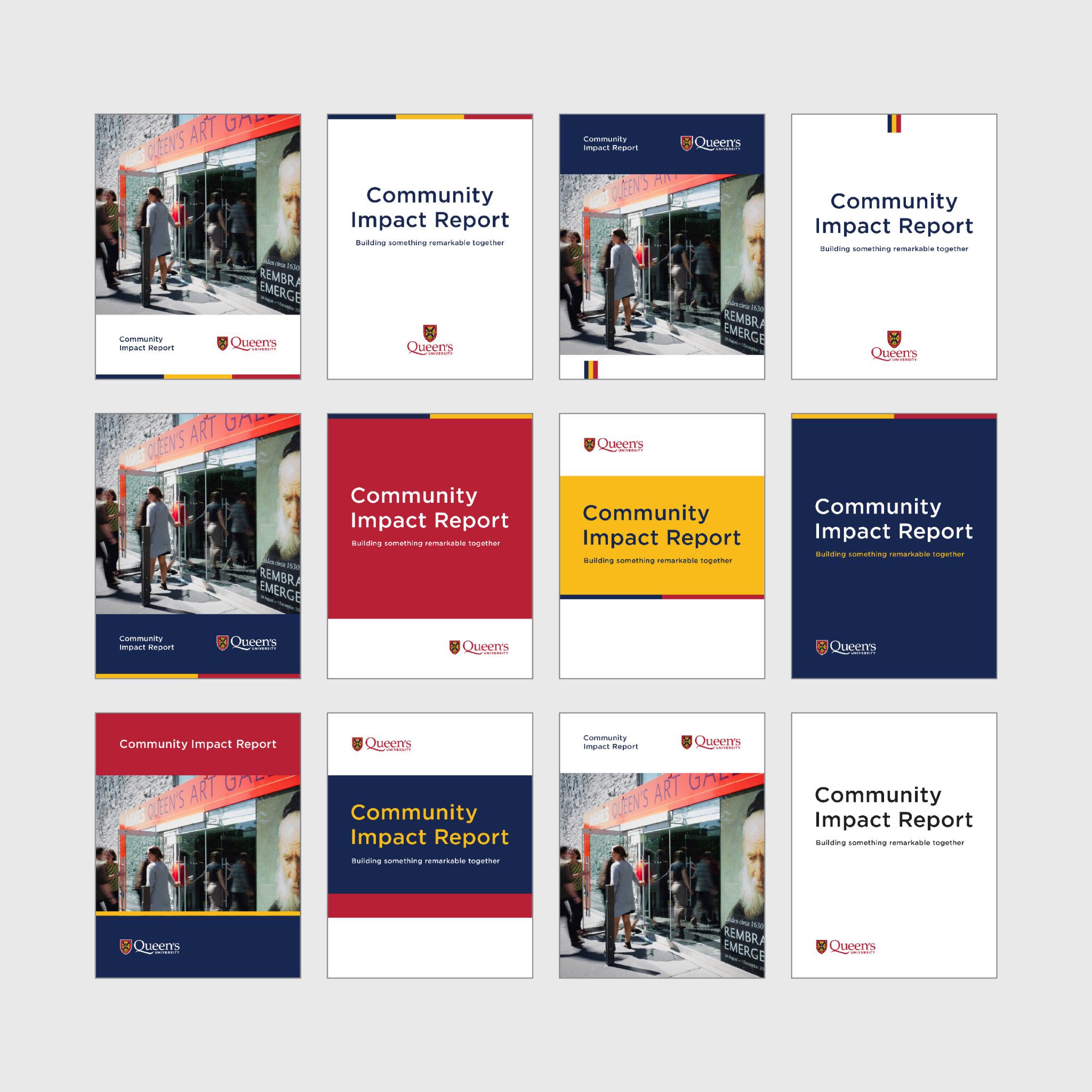
Colour Application
Tricolour is a “colour” and a critical component of the Queen’s brand. As such, it must be incorporated into all Queen’s applications. Below are some recommended methods:
Equal small accents of tricolour can be added to an otherwise neutral application. This can be achieved by adding the tricolour bar or the tricolour tab to the edge of a layout.
Tricolour can also be applied by selecting one of the three primary colours to be dominant, with the two remaining colours as smaller accents. This can be achieved by adding the two-colour bar to a coloured background.
Colour blocking can be used to create an even tricolour effect by incorporating blue, gold, and red areas of colour and typography.
A minimal colour layout in which tricolour is brought in through the Queen’s logo alone is another acceptable design method for more simple applications.
For additional guidance on the application of tricolour, refer to the Design Style section of the Visual Identity Guide. (PDF 10.2 MB)
Accessible Colour Contrast
Colour contrast is vital to ensure readability, especially for people with visual disabilities.
These examples were tested using a colour contrast checker and align with the Accessibility for Ontarians with Disabilities Act (AODA) contrast ratio requirements as per the Web Content Accessibility Guidelines (WCAG).
All other colour combinations used should be tested with a colour contrast checker, with AAA compliance being ideal. For more information and tools, visit the Queen’s Accessibility Hub.
Level AAA
The visual presentation of text has a contrast ratio of at least 7:1, except for large-scale text which has a contrast ratio of at least 4.5:1.
Level AA
The visual presentation of text has a contrast ratio of at least 4.5:1, except for large-scale text which has a contrast ratio of at least 3:1.
White AAA for all text sizes
Gold AAA for large text
White AAA for large text
White AA for all text sizes
Black AAA for all text sizes
Blue AAA for all text sizes
Red AAA for large text
Red AA for all text sizes
Dark Limestone AAA for large text
Dark Limestone AA for all text sizes
Black AAA for all text sizes
Blue AAA for all text sizes
White AAA for all text sizes
Light Grey AAA for all text sizes
Gold AAA for all text sizes
Black AAA for all text sizes
Blue AAA for all text sizes
Red AAA for large text
Red AA for all text sizes
Dark Limestone AAA for large text
Dark Limestone AA for all text sizes
Large text is defined as 14 point bold (typically 18.66px) or larger, or 18 point regular (typically 24px) or larger.
On-Screen Colours
Pure black is not recommended for on-screen applications. Instead, use the HEX code provided in our secondary palette. Webpublish3 templates provide pre-set colours to deliver an accessible user experience on Queen’s websites.