Human Rights & Equity Office
Why make documents accessible?
Making accessible documents ensures that they are usable by the widest range of users, but also ensures your document is easier to edit and navigate. It is important to make these changes to your documents and presentations to accommodate a variety of disabilities. For example, many people with visual disabilities use screen readers which read aloud information on the screen such as text or image descriptions provided through alternative text (Alt Text).
If you plan, format, and structure your document correctly in the beginning, it will ensure the file is not only accessible but can also be converted into a variety of different alternate formats (e.g. PDF or braille) while retaining its accessibility features.
Legislation
As of January 1, 2013, Ontario Regulation 191/11, section 15: requirement to provide educational or training resources or materials in an accessible format, if notification of need is given.
If posting document online - By January 1, 2014, Ontario Regulation 191/11, section 14: new internet websites and web content on those sites must conform with WCAG 2.0 Level A and by January 1, 2021, all internet websites and web content must conform with WCAG 2.0 Level AA.
As of January 1, 2015, Ontario Regulation 191/11, section 12: requirement to provide, upon request, accessible formats and communication supports.
Common Elements
Font Style and Size
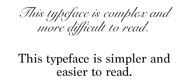
There is not a best typeface or font. Experts disagree on which typefaces provide the best readability.
- Use simple, familiar, and easily-parsed fonts.
- Avoid character complexity
- Avoid character ambiguity
- Use a limited number of typefaces, fonts, and font variations.
- Consider spacing and weight.
- Ensure sufficient, but not too much, contrast between the text and the background.
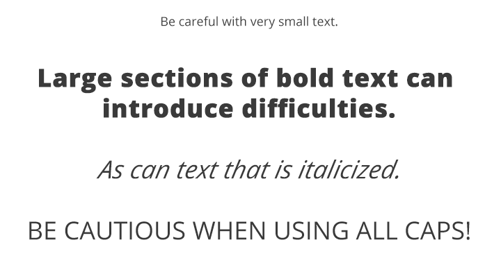
- Avoid small font sizes and other anti-patterns.
Fonts: Complexity & Ambiguity
Simpler shapes and patterns of typographical text are more quickly and accurately analyzed by the human mind. Be careful with complex fonts, especially for long sections of text.
When glyphs or characters within a typeface appear similar to another, this can introduce ambiguity which must be processed by the brain, thus impacting reading speed and understanding.
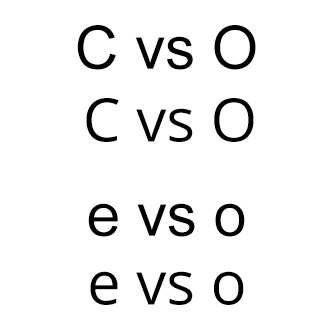
The texts above illustrate common ambiguities. The capital letters "C" and "O" and lowercase letters "e" and "o" in the Arial typeface look very similar due to the very narrow opening in the letters. This is contrasted with the wider opening and more distinct differences between "C" and "O" and "e" and "o" in the Open Sans typeface.
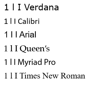
Similarly, capital "I", lowercase "l", and numeral "1" appear almost identical in some fonts, but are much more easily distinguished from each other in Verdana. Even though Verdana is a bit more complex, this minor complexity helps with disambiguation of characters.
Fonts: Size & Styles
- Avoid font sizes smaller than 10 pt.
- Use bold instead of italics or underlining text.
Source: WebAim Typefaces and Fonts
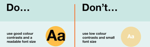
Appropriate Use of Colour
When using colour, you must make sure that any information conveyed with colour is also conveyed in black and white. For example, if you’re using colour to identify key words in a document, make sure that you also make them stand out in another way (for example, by putting them in bold; italics are not recommended).
Colour Contrast
You must provide high colour contrast to the text in your document. A good example of high colour contrast is black and white; while an example of poor colour contrast is light yellow and white.
Colour Contrast Checker
TPGi’s free color contrast checker tool that allows you to easily determine the contrast ratio of two colors simply using an eyedrop tool.
Alternative Text
Any pictures, graphs or text boxes within a document must be given alternative text. Alternative text must give an accurate description of what the item is, so that the user’s assistive technology may convey what information is demonstrated by the item. It is a best practice to avoid WordArt and text boxes as they may be inaccessible by screen readers.
There are a couple of different methods to enter alt text for an image:
- Right-click on the image and select Edit Alt text, then enter appropriate alternative text in the field that appears in the Alt Text sidebar.
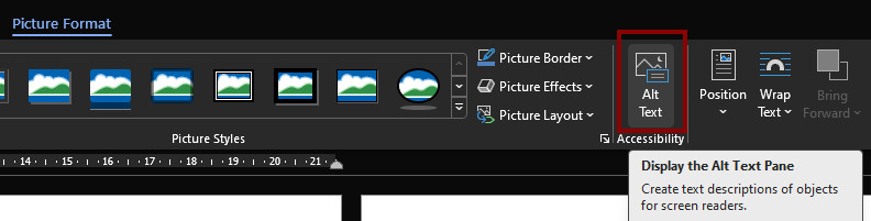
- Perform a single left-click on the image. A Picture Format menu option will appear. Select the Alt text button.
If the image is decorative, leave the field blank and check Mark as decorative.
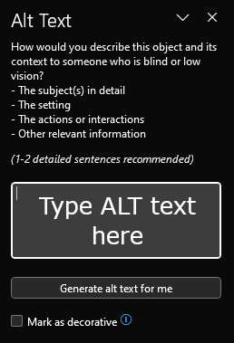
Do not select the "Generate a description for me" button. The quality of the automatically-generated descriptions is usually very poor, and a description of an image is often not the same as alternative text.
How to Create Good Alternate Text
- Consider the content and function of your image.
- If it provides content to your document, make sure that the information the image provides is described in the alt text.
- If your image only provides a function (for example, providing a portrait of a historical figure described in the text) you need only describe the image. In the case that the image is of a historical figure, write his/her name as the alt text.
- Try not to use “Image of...” or “Graphic of...” as alt text. That is usually evident to the person reading the alt text.
- Do not repeat the information which is contained in the document itself into the alt text. If it's already in the document, that should be enough.
Tables
Use the Microsoft Word® tool to create tables. If you use the “Draw Table” tool, it will be difficult for your table to be read by assistive learning technology.
Inserting a Table
- Click on Insert in the toolbar.
- Select Tables.
- Select the number of columns and rows you wish.
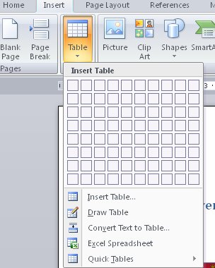
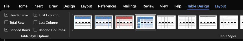
Table Headings
- Click anywhere in the table.
- Go to the Table Design tab at the top of the page.
- If the top row of the table contains headers for each column, ensure the Header Row checkbox is checked.
- If the first column of the table contains headers for each row, check the First Column checkbox.
Hyperlinks
To link your document to a website or another document, you may use hyperlinks. When doing so, make sure that the Hyperlink has context and describes where it leads. It should not just read “click here”, and should make it clear what the destination of the link is (example, the web link www.queensu.ca should be written as "Queen's University").
However, if you are creating a document that is intended to be displayed both electronically and in print, you may want to include the URL and a description in the link text. For example, "Queen's University (queensu.ca)."
When linking to a file, indicate the format and document size for example: Accessibility Annual Status Report 2022 (PDF 769KB)
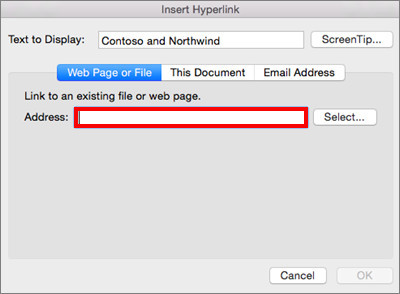
Inserting a Hyperlink
- Highlight the text you wish to be the link.
- Click on Insert in the toolbar.
- Select Hyperlink from the Links box. A new window will pop up.
- You can hyperlink to a web site, place in this document, or an email address. Select the type of link you want, enter the information then select OK.
Graphs and Charts
To make Charts and Graphs accessible, it may require explanations to explain the content. There are two actions recommended to make these items accessible.
The first is to add a short caption preceding them that describes their content. The second is to provide an alternative presentation of the findings. For many charts, the best alternative format in which to present data is a table with the original figures. Some graphics should include good alternate text but also a text description of the data contained in the image.
To add a caption:
- Right click near the edge of the chart, graph or table and choose Insert Caption
- Word gives you a few default options for your caption. If you’d like to create your own select New Label and enter your caption into the pop-up dialog box.
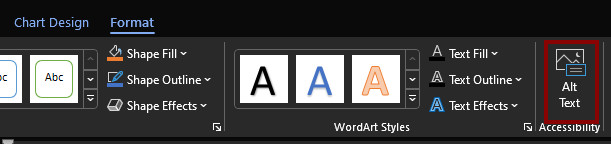
To add alt text:
- either right-click near the edge of the chart, graph, or table and choose View alt text or
- Perform a single left-click on the image. A Format menu option will appear. Select the Alt text button.
Using Office’s Accessibility Checker
Office comes with an accessibility checker that can aid in checking for problems in your document. This tool makes it easy to identify problems in your document, and explains what needs to be fixed.
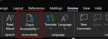
There are a couple of ways to open the accessibility checker. One way:
To start the Accessibility Checker, select the Review tab, then choose Check Accessibility.
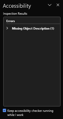
The Accessibility Checker sidebar will appear to the right. The checker presents accessibility errors (e.g., images with no alternative text), warnings (e.g., unclear link text) and tips (e.g., layout tables are structured for easy navigation). Selecting an item in the report will highlight the issue within the slide. Information about the issue, and instructions on how to repair it, will also appear at the bottom of the sidebar.
It is a good idea to check 'Keep accessibility checker running while I work'. The accessibility status of the document will be continuously shown at the bottom.
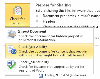
Another method to check document accessibility is:
- Go to the File Tab and select Info
- Click the Check for Issues button and select Check Accessibility.
Word
Styles
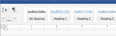
Styles are formatting instructions automatically programmed into Word. Styles are used in lieu of the buttons on the toolbar (for example, the “Bold” button, or the “Bullets” button). Use them to create:
- Titles (using the “Title” style)
- Headings (using one of nine “Heading” styles)
- Subtitles (using the “Subtitle” style)
- Bulleted Lists (using one of five different “List Bullet” styles)
- Numbered Lists (using one of five different “List Number” styles)
- Words in italics (using the “Emphasis” style)
- Words in bold (using the “Strong” style)
- Underlined words (using the “Subtle Reference” style)
To use a style
- Click on Home in the ribbon toolbar. The fourth box from the left in the home ribbon is the Style box.
- Before typing in any text, select the style you would like to use.
- For example, click on Title if you wish to create a title. Type in your title. Press enter, and your text will revert to the Normal (default) style. From here, you can continue using the appropriate styles. For instance, you could start writing your text in the Normal style, or you may want to create a heading. To create a heading, click on a Heading style, and then input your text.
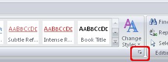
- To see a list of more styles, click the expansion arrow at the bottom right corner of the Styles box. Go to Options in the bottom right corner, and in the new window which pops up, select All styles in the first drop down menu. Select OK and the Styles window will now show many more styles.
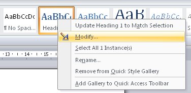
To modify a style
- Right Click on the icon of the particular style in the menu.
- Select Modify. A new window will open.
- Click Format (found in the bottom left corner of the window).
- In the pop-up menu, select the change you wish to make. For example, if you wish to change the written text, select Font
- Changes which are made to one style will appear throughout the document where that particular style is used.
Headings
Headings are a type of Style which makes it easier for various adaptive technologies to navigate a document. Many people do not create Headings correctly, either making font sizes bigger or in bold rather than using the formats already provided by Word. By using Headings, you are creating a real structure in your document which will be correctly read by assistive technology and will make the page more usable for everyone. In Microsoft Word, there are several different styles of Headings to choose from. See the instructions on how to use/modify Styles to learn how to incorporate Headings into your text.
Heading levels should represent the structure of the document.
- A Heading 1 is the document title or a main content heading. There is generally just one Heading 1 per document, although it is possible to have more than one (e.g., a journal where each article is a Heading 1).
- A Heading 2 is a major section heading.
- A Heading 3 is a sub-section of the Heading 2.
- A Heading 4 is a sub-section of the Heading 3, and so on.
You should not skip heading levels, such as using a Heading 4 after a Heading 2 with no Heading 3 between the two.
Columns
If you create columns using spaces and tabs, it will not be recognized as a column by assistive technology.
Inserting Columns
- Click on Layout in the toolbar.
- Select Columns in the Page Setup group.
Tools to Avoid Using
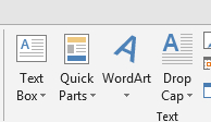
Adding Text Boxes, Quick Parts, Word Art, and Drop Caps should be avoided since content can be inaccessible or difficult for persons with low vision.
PowerPoint
Creating Slide Layouts
Using these built-in layouts and templates will ensure help that your presentations have properly structured headings, lists, and proper reading order. This will not only ensure that your content is accessible but will be better organized and easier to read by everyone.
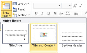
Select the Home tab, then New Slide, and a menu of slide types will appear.
Outline and Notes Panels
Both the Outline and Notes panels may be used to enhance accessibility of your presentation.
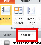
Outline Panel
By viewing your presentation in Outline view, you can ensure your slides are logically sequenced, that slide titles and content are meaningful, and that reading order is appropriate. To view the Outline simply select the Outline tab on the left-hand pane below the menu ribbon.
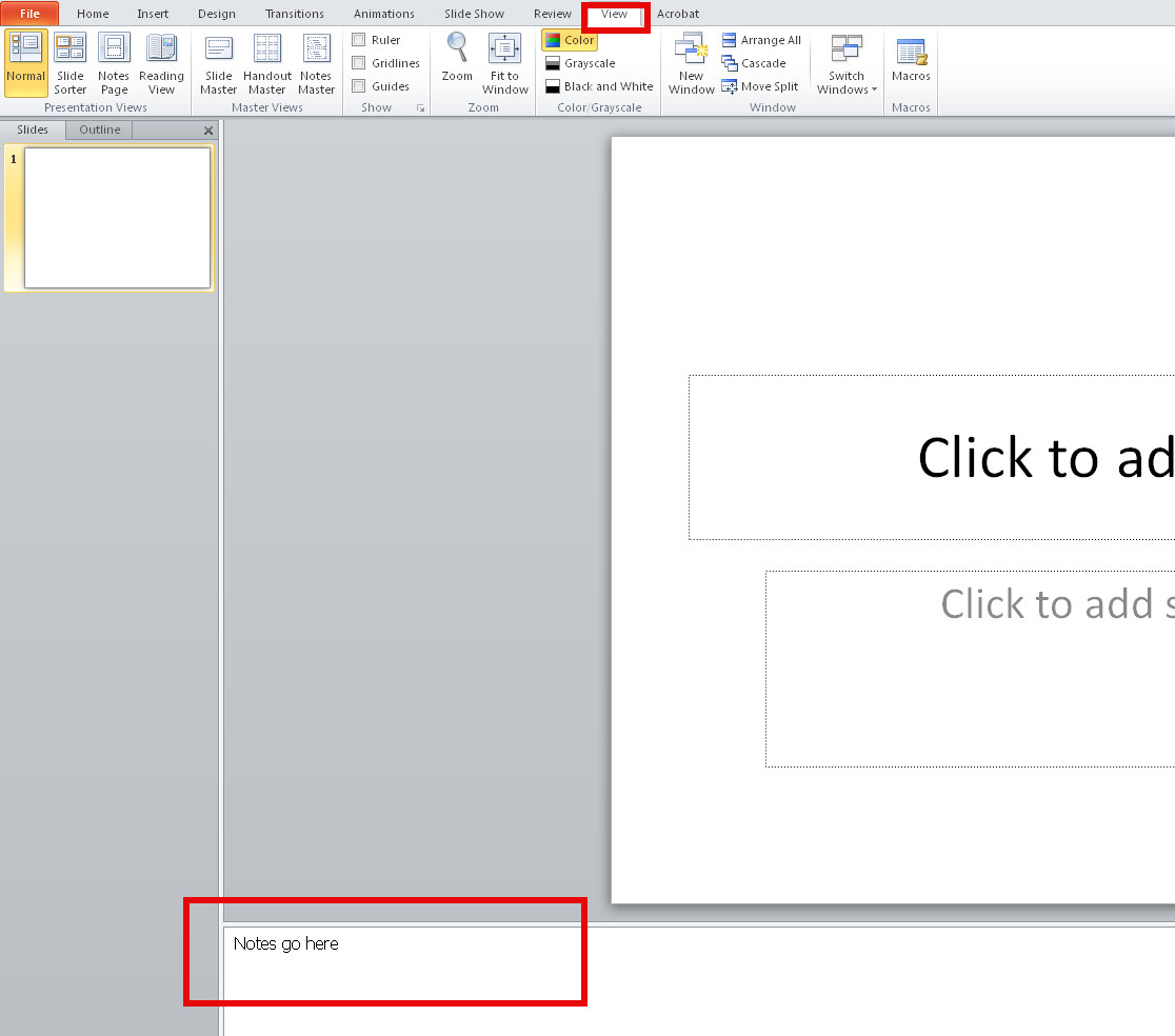
Notes Panel
The Notes Panel can be used to input notes to explain and expand on the contents of your slides in text format. Within PowerPoint the notes can be accessed by screen readers but if the presentation is saved to some other format like a PDF the notes may be inaccessible to screen readers.
- Select View tab from the ribbon;
- In the Presentation Views section, select Normal;
- The Notes Pane can be found at the bottom of the window;
- Type and format your notes.
If your presentation has embedded audio or video you should include text transcripts and/or captions.
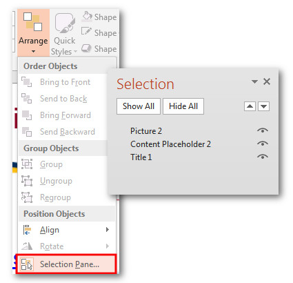
Screen readers will read each slide in a particular order. It is important to manually verify the order in which each slide is arranged to ensure the information makes sense when read aloud.
- Go to the Home tab.
- Select the Arrange icon to see a drop-down list of commands
- Choose Selection Pane
Important: In the Selection Pane, the reading order is from bottom to top. Meaning, the item on the bottom is in the item that will be read first.
To rearrange the reading order of the items, either drag and drop items to the desired order in the list or use the re-order button in the Selection Pane.