Appropriate Use of Colour
When using colour, you must make sure that any information conveyed with colour is also conveyed by another means. For example, including text with colour-coded icons will help to clarify the function of the icon. Marking required form fields in another way (either with an * before the field, using the word "required" after the form-field label) or using appropriate headers and contextual navigation in each distinct section of the web site will help to alleviate these colour-reliant issues.
Consider a form that indicates "all required fields are marked in red," a page that states "click the green button to continue," or a web-based report that shows status icons for transactions that differ only in their colour. In each of these cases, someone that may not be able to distinctly recognize certain colours because of their monitor settings, because of colorblindness, or because he/she is using a device that doesn't display colours would experience difficulty getting the information or completing the task at hand.
Colours and Cascading Style Sheets (C.S.S.)
Using style sheets for presentation is not without pitfalls. Because there are so many interacting style rules that are required to create a full web site, colours must be paired when they are declared in a style sheet. This ensures that there are always contrasting colours when the style sheet is applied to a document and, when the style sheet is not there or is overridden, that both foreground and background are affected. Design errors occur when text colour is determined by the style sheet while the background colour is declared directly in the HTML. As an example, when Cascading Style Sheets are turned off (via the user's browser settings) or not supported (alternative browser), this could result in default blue-coloured links laid out on a dark-coloured background, making the links impossible to read.
Thus, all colours should be declared in pairs in style sheets. Such a declaration may look like this:
a {color: red; background-color: transparent;}
Colour Contrast
You must provide high colour contrast to the text in your document. A good example of high colour contrast is black and white; while an example of poor colour contrast is light yellow and white.
Avoid blinking or scrolling text.
The visual presentation of text and images of text has a contrast ratio of at least 4.5:1, except for the following: (Level AA)
- Large Text: Large-scale text and images of large-scale text have a contrast ratio of at least 3:1;
- Incidental: Text or images of text that are part of an inactive user interface component, that are pure decoration, that are not visible to anyone, or that are part of a picture that contains significant other visual content, have no contrast requirement.
- Logotypes: Text that is part of a logo or brand name has no minimum contrast requirement.

Colour Contrast Checkers
Formatting Text
Semantic structure
Preparing content for the web is much more than just copying text from your favourite word processor and pasting it into the framework of a web page. In order to ensure the greatest accessibility and widespread availability of web content, it is important to consider that there is more to the web page than the words and pictures that end up in a person's browser.
Web pages are built with HTML, a structural language that is used to denote the different structural parts of the document. HTML employs an extensive series of opening and closing tags to mark parts of the document as, for example, headings (<h1></h1>), unordered lists (<ul></ul>), ordered lists (<ol></ol>, and paragraphs (<p></p>). These tags don't appear in the final view of the web page, but are used by the various web software applications to interpret the intended format of the text for output to the end user.
To help clarify the term semantic further, consider that some HTML tags (such as the <strong> for bold text) are not considered semantic elements but are presentational elements, i.e. while they do alter the visual presentation of the text, they don't define the actual structure of the text.
Using semantically structured HTML and then changing the way that the HTML looks with Cascading Style Sheets results in the final version of the web page that looks aesthetically pleasing to people viewing the web page in a browser, and is logically structured, providing meaning to those that need it. Pages built this way are not only accessible to the largest possible audience, but are also well set for future revision of both style and content, and can be easily adapted to accommodate emerging technology and advancing web development standards.
Fonts
Font Style and Size
There is not a best typeface or font. Experts disagree on which typefaces provide the best readability.
- Use simple, familiar, and easily-parsed fonts.
- Avoid character complexity
- Avoid character ambiguity
- Use a limited number of typefaces, fonts, and font variations.
- Consider spacing and weight.
- Ensure sufficient, but not too much, contrast between the text and the background.
- Avoid small font sizes and other anti-patterns.
Fonts: Complexity & Ambiguity
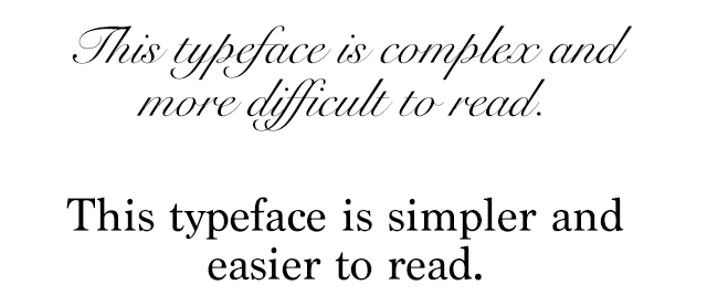
Simpler shapes and patterns of typographical text are more quickly and accurately analyzed by the human mind. Be careful with complex fonts, especially for long sections of text.
When glyphs or characters within a typeface appear similar to another, this can introduce ambiguity which must be processed by the brain, thus impacting reading speed and understanding.
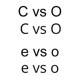
The texts above illustrate common ambiguities. The capital letters "C" and "O" and lowercase letters "e" and "o" in the Arial typeface look very similar due to the very narrow opening in the letters. This is contrasted with the wider opening and more distinct differences between "C" and "O" and "e" and "o" in the Open Sans typeface.
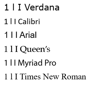
Similarly, capital "I", lowercase "l", and numeral "1" appear almost identical in some fonts, but are much more easily distinguished from each other in Verdana. Even though Verdana is a bit more complex, this minor complexity helps with disambiguation of characters.
Fonts: Size & Styles
- Avoid font sizes smaller than 10 pt.
- Use bold instead of italics or underlining text.
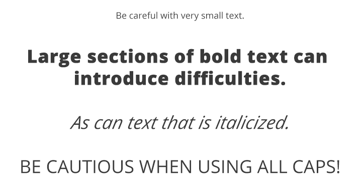
Source: WebAim Typefaces and Fonts
Headings
Using Headings makes it easier for various adaptive technologies to navigate a document. Many people do not create Headings correctly, either making font sizes bigger or in bold rather than using the formats already provided by WebPublish. Heading need to be marked up in the html code. Heading levels should have a meaningful hierarchy and it is recommended to reserve H1 for the page title, H2 for major headings and H3 for major sub headings.
HTML Code
<h1>Queen’s University</h1>
<p>Located in Kingston, Ontario…</p>
<h2>Weather</h2>
Using WebPublish
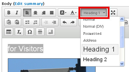
While you’re editing a draft:
- Select the text you would like to make into a heading.
Select the desired format from the format menu drop-down list.
Queen's Web Standards and Accessibility Development Guide (WSADG)
For your reference, sections of the WSADG used for this part of the tutorial are:
 Human Rights & Equity Office