Icons are hardworking. They can call attention to important information, represent complex concepts, minimize the need for text on a page, create mood, provide direction and note calls to action. When used effectively, they do a lot to enhance a web page or a website. When overused or used poorly, they can have a negative impact on usability.
Adding icons in WebPublish
WebPublish users can add icons to a webpage by selecting the Font Awesome icon within the WYSIWYG content editor and entering the icon file name.
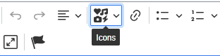
Select the icons option
in the WYSIWYG editor
See our Buttons and Link Styles page for a how-to guide to add icons to links, especially to signify document downloads, such as this:
Example (PDF 10KB)
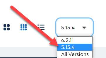
Visit the Font Awesome gallery to see all the available icons and their file names. Note that after searching for an icon, you must choose version 5.15.4 from the drop down on the right hand side to see the Font Awesome icons available in WebPublish.
Tips for using icons
Don't use them as the sole way of conveying information.
Do use them to enhance a users understanding or to draw attention to a piece of content.
Don't assume that icons are universally understood. Many icons are understood differently, or not at all, by different cultures or age groups.
Don't use icons in a unique way or contrary to what might be seen as common understanding of the symbol. For example, a + on a website usually indicates an open/collapse function, such as in our accordion containers, so don't use a + as a list icon.
Do include text with your icon. Best practice says to include text with an icon, especially where is it is used in a navigational element on a page.
Don't overuse icons. The more icons you use on a page, the less effective each one is at catching a user's attention.
Additional Resources
Article – Nielsen Norman – Icon Classification: Resemblance, Reference, and Arbitrary Icons