View the example page to see this paragraph-type in action.
Guidelines for use
- This block is always used at 100% width of the page container (not the browser window).
- It helps organize and group contents into sections.
- If the Title and Body on the left-hand side are not used, the accordion tab will remain the same width to maintain a readable line length but will center in the page layout.
- The title of each accordion tab should reflect clearly the content inside it, as the user will not see this content until they have opened it.
- Make sure this is the right paragraph for the type of content you have.
- It is very important to write good headings for each accordion tab, as well as to be very strategic as to which content goes in them.
- Accordion Tabs may seem like a good solution for condensing pages, but if the content is relevant, it’s better to show all the content even if it means a longer page. It’s easier to scroll through a page rather than to guess what you should click before clicking it. Usability studies and eye tracking shows that people are willing to scroll if the info is valuable and formatted properly for scanning.
- Refrain from using this section for FAQs. It is always better to better arrange your content onto pages. Learn more about FAQs
The only visible change that happens is that the left-hand Title and Body will stack on top of the accordion tabs.
How to implement
-
Create a Basic Page.
-
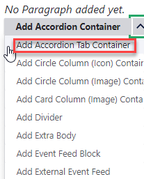
Scroll down to the Paragraphs section, click the drop-down arrow, and click "Add Accordion Tab".
-
Proceed to the Overview of an Accordion Tab section of this guide below.
-
Once you've added your divider, choose your publishing options and click Save at the bottom of the page.
Overview of an Accordion Tab
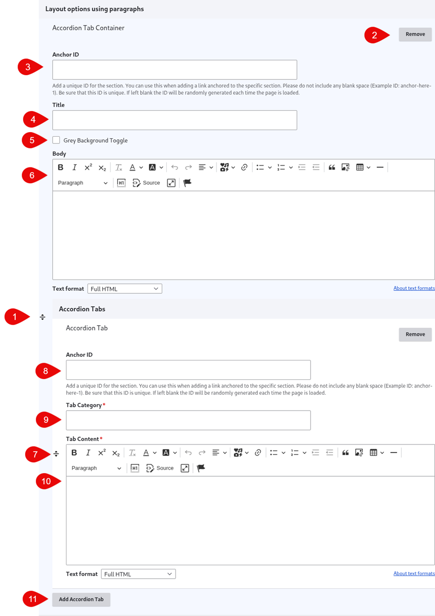
- Click and drag the crosshairs handle to rearrange your paragraphs.
- Remove this entire paragraph.
- Anchor ID - Add a unique ID for the section. You can use this when adding a link that you'd like to open to the place on the page where the Accordion Tab exists. Please do not include any blank space (Example ID: anchor-here-1). Be sure that this ID is unique.
- (Optional) Title - Add a title to introduce the accordion tab content. This content will appear left-aligned next to the tabs and will be formatted as an h2.
- Grey Background Toggle - if this option is unchecked, the divider will appear on a white background. If it is checked, it will appear with a grey background. Only use the grey background if you are adding a divider between two paragraphs that also use a grey background.
- (Optional) Body - Add a block of text providing descriptive information about the accordion tab content. This content will appear below the title and left-aligned next to the tabs. It will be formatted as a paragraph.
- Click and drag the crosshairs handle to rearrange accordion tabs within the paragraph
- Anchor ID - Add a unique ID for the section. You can use this when adding a link that you'd like to open to a specific accordion tab. Please do not include any blank space (Example ID: anchor-here-1). Be sure that this ID is unique.
- Tab Category - Add the text that you'd like to appear in the tab/heading portion of the accordion tab
- Tab Content - Add the text that you'd like to display when the accordion tab is open
- Add Accordion Tab - Add an additional accordion tab to the same paragraph