View the example page to see this paragraph in action.
Guidelines for using this paragraph
- This block is always used at 100% width of the page container (not the browser window).
- Avoid placing more than 2 of these blocks on top of each other.
- All column content in this block is center aligned.
- It is recommended for descriptions more than 300 characters to be left aligned instead of center justified.
- The best way to prepare content is to write great titles, description and Calls to Action for your text links.
- Have the same fields filled for each section to maintain visual balance, however not all fields must be filled in.
The only visible change that happens is that each section will stack and each column will be the full width of the device viewport.
If you choose to use images instead of icons, be sure that images have a minimum and maximum height of 200px. There's no need to crop the images into circles, WebPublish will do that for you. Pay special attention that your focal point is in the center of the image and be aware that the corner areas of the image will be cropped out.

How to use this paragraph
- Create a Basic Page.
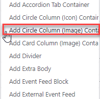
- Scroll down to the Paragraphs section, click the drop-down arrow, and click "Add Circle Image Column Container".
- Proceed to the Overview of a Circle Image Column Container section of this guide below.
- Once you've added up to 4 images, choose your publishing options and click "Save" at the bottom of the page.
Overview of a Circle Image Column container
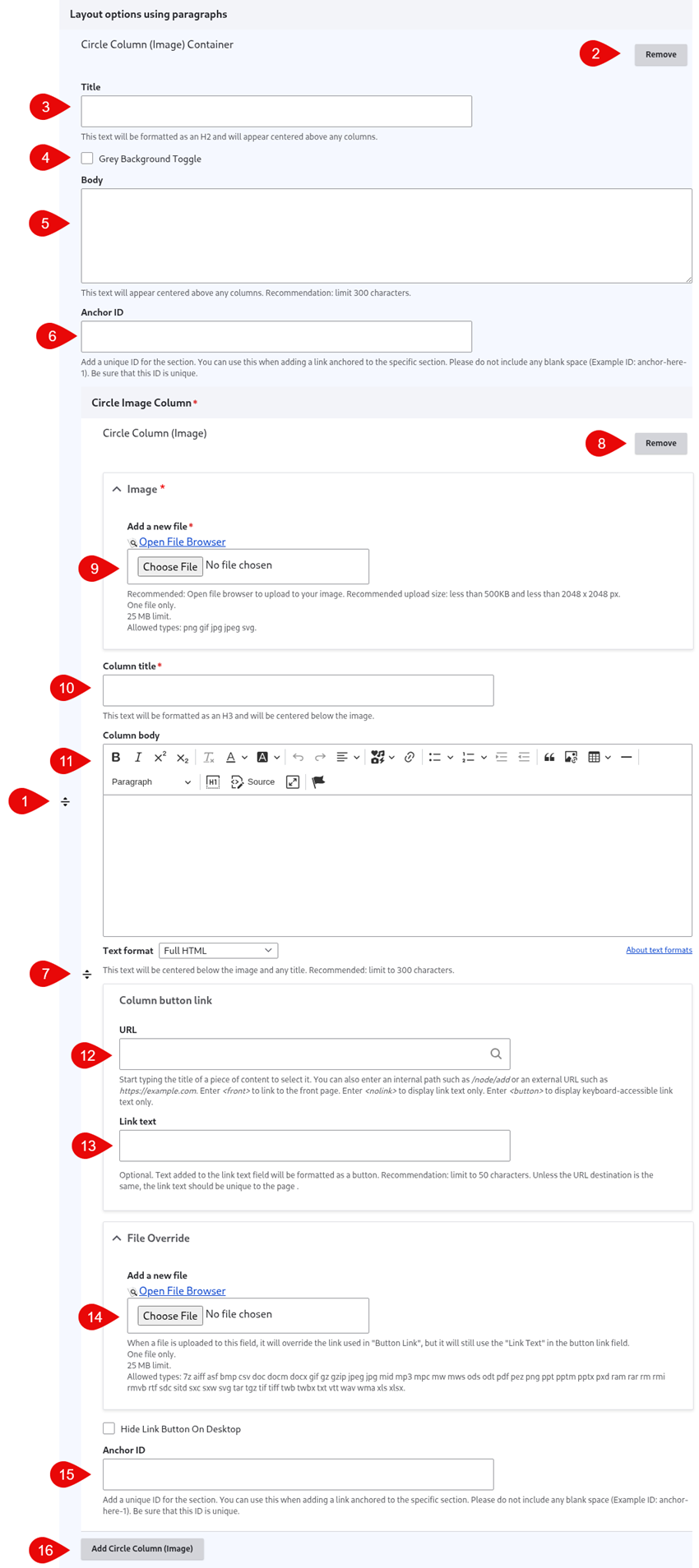
- Click and drag the crosshairs handle to rearrange your paragraphs.
- Remove the Circle Image Column paragraph.
- (Optional) Title - this is the title for the Circle Image Column paragraph. It appears above the photos.
- Grey Background Toggle - if this option is unchecked, the divider will appear on a white background. If it is checked, it will appear with a grey background. Only use the grey background if you are adding a divider between two paragraphs that also use a grey background.
- (Optional) Body - this is the body for the Circle Image Column paragraph. It appears above the photos.
- (Optional) Anchor ID - add a unique ID if you'd like to link to this specific section of the paragraph from another location
- Click and drag the crosshairs to rearrange your photos within the Circle Image Column paragraph.
- Remove the Circle Column Icon.
- Image - upload an image for the column. It's recommended you use the file browser rather than uploading your images directly to the column. This way you can easily reuse images across your site.
- Column title - this title appears below the image.
- (Optional) Column body - this content appears below the image.
- (Optional) URL - this link appears below the image. If you will be uploading a file, enter <nolink> in this field - it will be overridden when you select your file in the File Override field.
- (Optional) Link text - this is the text for the link that appears below the image.
- (Optional) File Override - add a file if you would like the link set to link to a file instead of a URL
- You can either upload a file directory to the page, or open the file browser to upload the file to the site's central file repository. It is recommended that you open the file browser to upload, so that you can reuse the image in the future.
- If you are opting to use the File Override, you'll still need to fill in the URL field - we recommend adding <nolink>
- (Optional) Anchor ID - add a unique ID if you'd like to link to this specific column of the paragraph from another location
- Add Circle Column Image- this adds another Circle Image Column. There are no limits on the number of circle column icons you can add. Containers will automatically stack in rows of up to 4 containers per row.