View the example page to see the "Slider" paragraph in action.
Hero, Full-Width, and Slider Images Examples
Types of images
-
Hero image: this is a single image that spans the full width of your site and is placed above the title and body of your page. There are two sizes, 500px high and 250px high.
-
Full width image: this is a single image that spans the full width of your site and is placed below the page title. The only difference between a hero Image and a full-width Image is the location.
-
Slider: this is a slideshow that spans the full width of your site and can be placed anywhere on the page. This is also the container for hero and full-width images.
- Create a page.
- Navigate to the Paragraphs Top section of your page and click Add Hero Image.
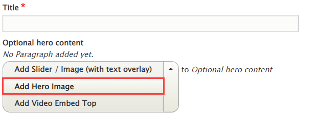
- Once you've added your image, scroll down to the bottom of the page, choose your publishing options and click Save.
- Create a page.
- Navigate to the Paragraphs Top section of your page and click Add Slider.

- See the Overview of a Slide section of this guide below.
- Once you've added your image, scroll down to the bottom of the page, choose your publishing options and click Save.
- Create a Basic Page.
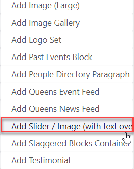
- Scroll down to the Paragraphs section, click the drop-down arrow, and click "Add Slider".
- Proceed to the Overview of a Slide section of this guide below.
- Once you've added your image, choose your publishing options and click Save at the bottom of the page.
- Follow steps 1 and 2 of either Adding a Hero Image or Adding a Full Width Image, depending on where you want your slider to be located.
- Proceed to the Overview of a Slide section of this guide below.
- Once you've added as many images as you want, choose your publishing options and click Save at the bottom of the page.
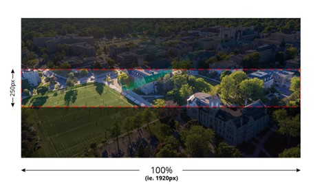
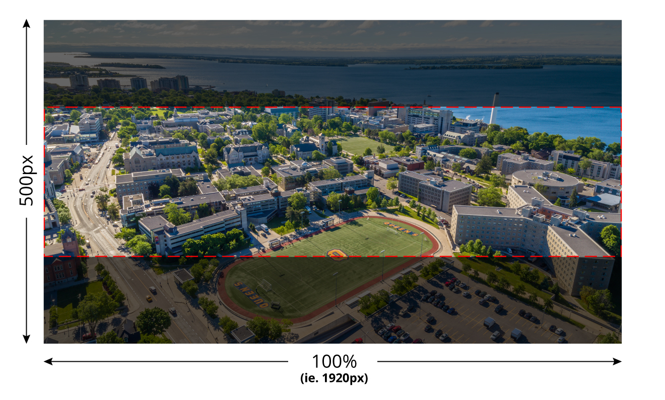
The scaling of images is dependant on the end users screen size, resolution and the shape (ratio) of the image itself. Images will always be centred both vertically and horizontally and will always occupy 100% of the container by default. In order to achieve this, cropping of the image is necessary. Use the focal point selector if you would like to overwrite this behaviour.
In this first example you will see that on a desktop device.
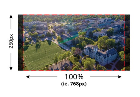
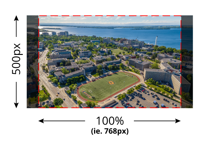
In this next example we'll look at a tablet which typically isn't as wide as a desktop device. As you can see, in this case, the image scales to fit the height and the image is cropped along the left and right edges.
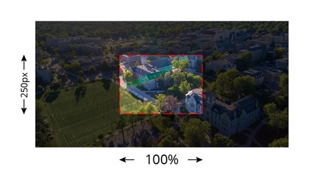
On mobile devices we go from a horizontal view to a portrait view. The hero section image on mobile devices still displays at 250px in height. You will typically get a lot of cropping on the left and right edges, and some top and bottom, so be sure that your focal point is in the horizontal centre of your image, or else use the focal point selector to adjust.
The scaling of images is dependant on the end users screen size, resolution and the shape (ratio) of the image itself. Images will always be centered both vertically and horizontally and will always occupy 100% of the container by default. In order to achieve this, cropping of the image is necessary. Use the focal point selector if you would like to overwrite this behavior.
In this first example you will see that on a desktop device.
In this next example we'll look at a tablet which typically isn't as wide as a desktop device. As you can see, in this case, the image scales to fit the height and the image is cropped along the left and right edges.
On mobile devices we go from a horizontal view to a portrait view. The hero section and slider images are set to take up 85% of the devices vertical screen size. You will typically get a lot of cropping on the left and right edges so be sure that your focal point is in the horizontal center of your image, or else use the focal point selector to adjust.

You’re encouraged to view your site on your mobile device to make sure content is showing as you intended. In the case of images, going from a landscape setting (desktop screens) to a portrait setting (mobile screens), can sometimes deliver sub-optimal results. For this reason, WebPublish 3 offers you the option to upload an image specifically for mobile use.
Example: If your original image (fig.1) gives you a nice focal point on desktop with adequate space for legible text, there’s no guarantee you’ll get the same result on mobile. In this example, your focal point will “bleed” off the side of the screen. (fig.2)
fig.1

fig.2

In this case, the recommendation is to re-crop your original image, and save it as a separate file with a similar naming convention. (ie. Desktop Image: hero_image.jpg. Mobile Image: hero_image_mobile.jpg).

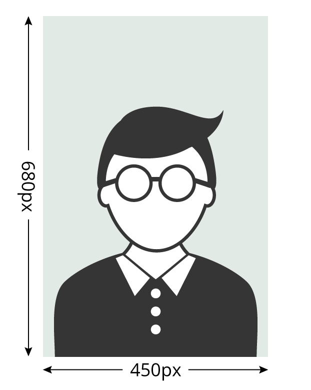
If cropping your existing image is proving difficult, by all means use another image that give you the result you’re looking for. The recommended size for this image is 680 pixels high by 450px wide and of course, optimize your image so there’s a healthy balance of quality and file size.
Note: there is no mobile option for the 250px high hero image, as these are intended to be decorative images.
Find more information on image sizing:
Optimal Image Sizes
Overview of a slide
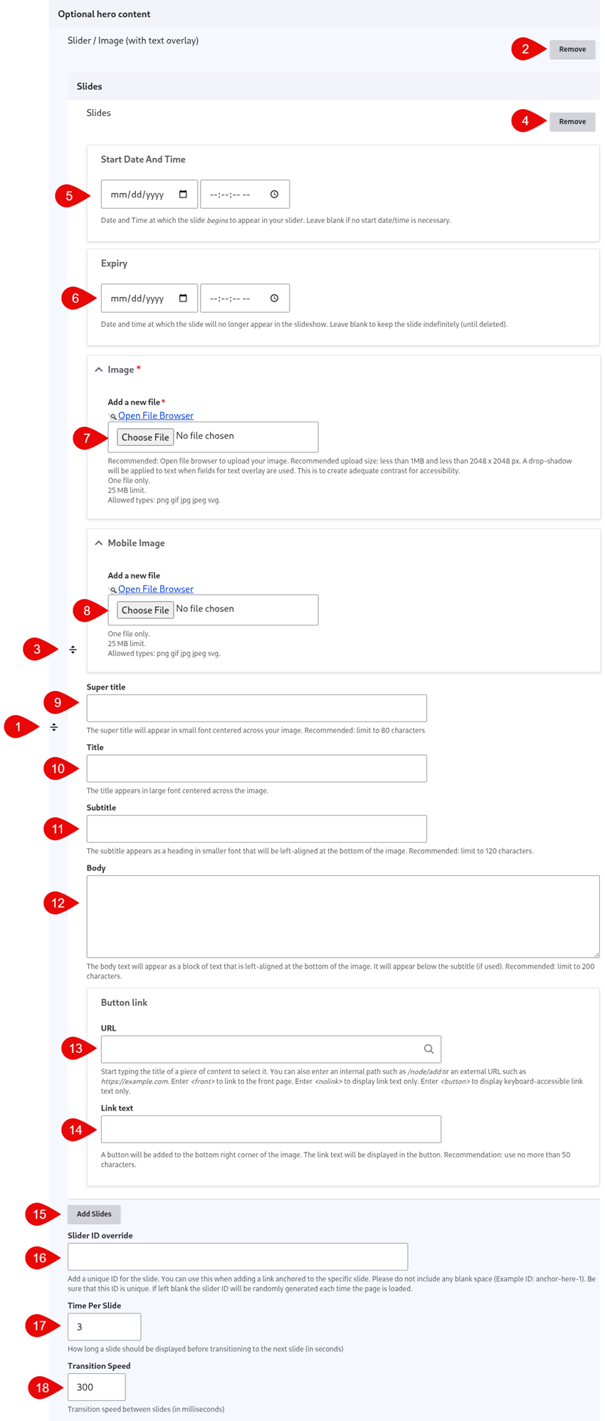
- Click and drag the crosshairs handle to rearrange your paragraphs.
- Remove this entire paragraph.
- Click and drag the crosshairs handle to rearrange your slides.
- Remove this individual slide.
- (Optional) Start Date - set a date and time for this image to be made live on your site.
- (Optional) Expiry - set a date and time to retire an image from the Slider.
- Image - upload an image for the slide. It's recommended you use the file browser rather than uploading your images directly to the slide. This way you can easily reuse images across your site.
- (Optional) Mobile Image - upload an image for the slide that you'd like to appear on the mobile version of the slider. It's recommended you use the file browser rather than uploading your images directly to the slide. This way you can easily reuse images
- (Optional) Super Title - this text appears above the title.
- (Optional) Title - this text appears centre-aligned across your image.
- (Optional) Subtitle - this text appears above the body.
- (Optional) Body - this text appears left-aligned on your slide.
- (Optional) URL - the URL of the button link.
- (Optional) Link text - the link text of the button link.
- (Optional) Add Slides - add additional slides to your Slider.
- (Optional) Slider ID Override - add a unique ID to link to this specific slide.
- (Optional) Time Per Slide - the amount of time in seconds each slide is displayed. Editing this has no effect if you only have one image.
- (Optional) Transition Speed - the amount of time in milliseconds it takes to transition from one slide to the next. Editing this has no effect if you only have one image.