WebPublish has a WYSIWYG (What You See Is What You Get) editor that makes creating a web page as easy as creating a word-processing document.
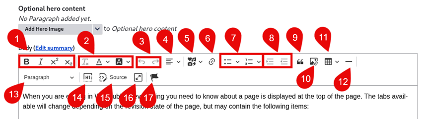
- Inline formatting options
- Text formatting options
- Undo/redo
- Paragraph justification options
- Increase/decrease indent
- Insert/remove link
- Add "Font Awesome" icon
- Insert a list
- Blockquote
- Insert an image
- Insert a table
- Insert a horizontal rule (line)
- Paragraph formatting options (e.g. Headers)
- Show blocks
- Show source toggle
- Full-screen toggle
- Anchors
Editing the source code
While viewing source code, the formatting of the text is not visible, just the text and the HTML tags that format the text. For easier reading, some of the code is indented.
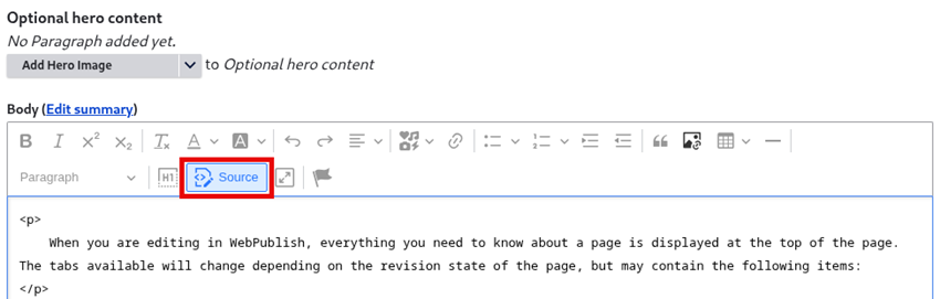
To see the source code for a section of content, select the "Source" button from the WYSIWYG toolbar. While viewing the source code, only two other buttons in that toolbar are available for use: the full-screen toggle button (so you can view the screen at full size or minimize the screen), and the Source button. When you are finished working in the source code, click the Source button to close it.
Pasting from a word processor: bad code and clean code
Whenever possible, type in your webpage text directly into the WYSIWYG.
If you copy and paste text from a document, another webpage, or another format, there is a good chance that you bring inline font styles and sizes, class specifications, and other styling that dos not belong.
Instead of simple tags like the ones pictured above, the source code will be full of style commands that can negatively impact not only the look of your content but also the accessibility and responsiveness of your design to various screen sizes, such as smart phones.
Example: This text, used as a mid-page page heading, was created in word, with some (ugly) styling applied.
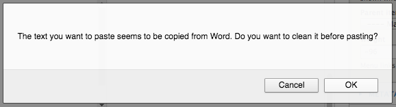
When copying and pasting from word, you encounter a screen like this, notably stripping out a font style that will not render across browsers:
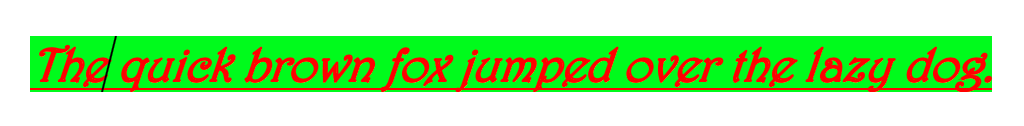
Once you select OK, it renders like this:
The quick brown fox jumped over the lazy dog.
And the source code looks like this:
<p style="margin-left:48px"><span style="font-size:12pt"><span style="font-family:"Calibri",sans-serif"><b><i><u><span style="font-size:20.0pt"><span style="background:lime"><span style="font-family:Harrington"><span style="color:red">The quick brown fox jumped over the lazy dog.</span></span></span></span></u></i></b><b><i><u><span style="font-size:20.0pt"><span style="font-family:Harrington"><span style="color:red"></span></span></span></u></i></b></span></span></p>
Note that:
- specifying a font size can interfere with the users ability to adjust how the font renders using keyboard commands and browser preferences
- the <b> tag is not the preferred way to add a bold style
- the <u> tag is reserved for and automatically applied to linked text
- though another font style was substituted, visitors to the page may still not be able to render the Calibri or Harrington styles
- an unnecessary left margin / indent setting was imported; web text is best left aligned left
- there is no semantic html used here, such as a heading tag, to indicate that this line of text is meant to function as a heading on the page
For similar (but still problematic) text styling, the cleaner code could look like this:
<h3><em><strong><span style="color:#FF0000; background-color:#00ff00">The quick brown fox jumped over the lazy dog.</span></strong></em></h3>
and render this:
The quick brown fox jumped over the lazy dog.
But furthermore, be aware that:
- the red-green colour combination in this example can impact users with colourblindness (various colour combinations register as almost the same colour to people with different kinds of colour blindness)
- the red-green colour combination in this example does not provide enough contrast for users with low vision
- any inline styles you add will not necessarily render the same way across the various operating systems and browsers that your visitors use when coming to your webpage
- the <strong> tag is not necessary when using the heading formats, such as the h3 used here
The "Remove Format" tool
The WYSIWYG can strip out some unnecessary code on past. Also, you can select text and clean up a lot of bad code using the "Remove Format" tool in the WYSIWYG editor -- the Tx icon in the text formatting group.
Non-breaking spaces " "
" " is the HTML code for a "non-breaking space."
Wherever you see this placed between words, it means that the line/sentence cannot break between those words.
While there are some occasions to use this code, mostly they should be removed. Most of them come into the code when text has been copied from another source rather than typed directly into the WYSIWYG editor. Leaving them in will impact your layout, and especially your layout on smaller screen sizes, such as phones, as the lines of text will not be able to break naturally at then end of any word as the line lengths change with screen size.
Keep it simple!
When it comes to decorating text online, the best guidance is to keep it simple. Stick to the default styles and formatting options offered by the CMS (WebPublish), and ensure that you have a good understanding of the best practices for publishing web content, as outlined in the Resources section of this website.
The quick brown fox jumped over the lazy dog.
<h3 style="color:#FF0000;">The quick brown fox jumped over the lazy dog.</h3>