View the example page to see this paragraph in action.
Guidelines for using this paragraph
- This block is always used at 100% width of the page container (not the browser window).
- The height of all the cards will stretch to fit the card with the most content (bottoms will all align).
- It is recommended for descriptions more than 300 characters to be left aligned instead of center
justified.
- The best way to prepare content is to write great titles, description and Calls to Action for your text links.
- Select an image that looks good alongside the background colour you’ve selected and vice-versa.
The only visible change that happens is that each section will stack and each column will be the full
width of the device viewport except for some padding on the sides.
Column card images are displayed at a 3:2 ratio. In an attempt to keep your file size as low as possible, please follow the recommendations below for optimal image sizes:
| Number of Columns | Width | Height |
|---|---|---|
| 1 | 1140px | 760px |
| 2 | 555px | 370px |
| 3 | 360px | 240px |
| 4 | 263px | 175px |
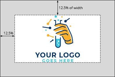
When using this paragraph type for displaying logos
Properly displaying logos can be problematic with a responsive layout and hover effect that changes the image size.
To ensure the full image is on view in the container, create a margin or "dead space" around it before loading it to the site.
- Create a base file (such as in Photoshop or other photo editing tool) that has a 3:2 horizontal ratio
- Leave a "dead space" around the entire outside of the image, equal to 1/8 of the total image size (i.e. for an image with of 400 pixels, leave a margin of 50 pixels all the way around)
- Place your logo as large as you can inside the remaining space and centre it as best you can (i.e. for an image with of 400 pixels, use the middle 300 pixels)
How to use this paragraph
- Create a Basic Page.
- Scroll down to the Paragraphs section, click the drop-down arrow, and click "Add Card Column Container."
- Proceed to the Overview of a Column Card Container section of this guide below.
- Once you've added up to 4 cards, choose your publishing options and click "Save" at the bottom of the page.
Overview of a Column Card container
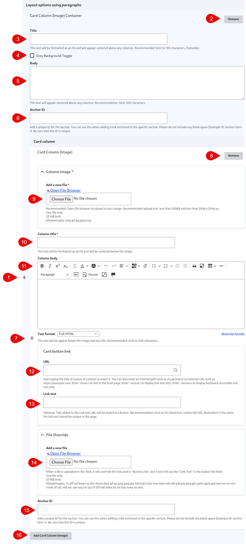
- Click and drag the crosshairs handle to rearrange your paragraphs.
- Remove the Column Card paragraph.
- (Optional) Title - this is the title for the Column Card paragraph. It appears above the photos.
- Grey Background Toggle - if this option is unchecked, the divider will appear on a white background. If it is checked, it will appear with a grey background. Only use the grey background if you are adding a divider between two paragraphs that also use a grey background.
- (Optional) Body - this is the body for the Column Card paragraph. It appears above the photos.
- (Optional) Anchor ID - add a unique ID if you'd like to link to this specific section of the paragraph from another location
- Click and drag the crosshairs to rearrange your photos within the Column Card paragraph.
- Remove the individual Column Card.
- Column image - upload an image for the column. It's recommended you use the file browser rather than uploading your images directly to the column. This way you can easily reuse images across your site.
- Column title - this title appears below the image.
- (Optional) Column body - this content appears below the image.
- (Optional) URL - this link appears below the image. If you will be uploading a file, enter <nolink> in this field - it will be overridden when you select your file in the File Override field.
- (Optional) Link text - this is the text for the link that appears below the image.
- (Optional) File Override - add a file if you would like the link set to link to a file instead of a URL
- You can either upload a file directory to the page, or open the file browser to upload the file to the site's central file repository. It is recommended that you open the file browser to upload, so that you can reuse the image in the future.
- If you are opting to use the File Override, you'll still need to fill in the URL field - we recommend adding <nolink>
- (Optional) Anchor ID - add a unique ID if you'd like to link to this specific column of the paragraph from another location
- Add Column Card - this adds another Column Card. There are no limits on the number of cards you can add. Containers will automatically stack in rows of up to 3 containers per row.